Wednesday, 31 March 2010

Final Print Advertisement Design

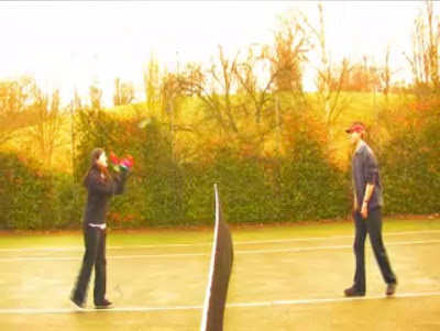
Above is the final (yes, final!!!) design for the DigiPak Print Advertisement. We have decided to use the tennis courts image used on the DigiPak front cover, which again is actually a screenshot taken from the main video, and edited and resized to fit the set layout for the DigiPak.

As on the Final DigiPak Design, we used red-coloured typeface to keep a running theme, and slightly changed the release date to add extra emphasis to this small, important piece of information. We added a couple of reviews, which we of course made up, to show that leading national newspapers and magazines had noticed the new release and to attract the potential audience of those newspapers and magazines (The Sun and The Sunday Times) to our CD DigiPak.

Final DigiPak Design

Above is the final (yes, final!!!) design for the CD DigiPak Covers. We have decided to use a 4-Sided layout, using an image of the "3 Ducks Parade" under the CD Placement Holder, and n image of a seagull flying with the backdrop of the sky at Ipswich Waterfront, for the inside of the DigiPak. Outside, we have decided to use an image of the two characters in the tennis courts as the front cover, and the establishing shot of our video as the back cover, where the trck listing has been placed. All images are actually screenshots of the main video, taken from the video file itself, and edited and resized to fit the set layout for the DigiPak.

DigiPak: Print Advertisement Ideas

On my PC at home, I studied different typefaces and fonts, stylistics, images, colours and layouts. Below are two of the initial ideas I had using the computer program 'Microsoft Publisher 2003'. At the bottom, i.e. the thrid picture, displays my ideas for typefaces to be used.

I showed these to Emily at our most recent Group Production Meeting. Unfortunately, Josh was absent and so the finalising of group ideas was left to Emily and me. She said she liked thf typeface used in the two designs, which was actually called "AR Darling".

5 Years Time: The Final Edit (Compressed)

Friday, 19 March 2010

SECOND EDIT: Issues

After completing what we think was our almost-ready final edit last Friday (12th March 2010), we showed the Second Edit (EDIT 2) to our Media Studies lecturer Jon. It was useful to show it to him as he gave us some more feedback about the video. He agreed that we had put a lot of work into the video, and said that now it just needs 'polishing up'.


He was unsure of the storyline at the end of the video, where I am lying in the road. Initially, in the script, this is the point at which we show the girl has died and the boy lies in the road where she died in a road accident, but Jon could not get the gist of this and was a little uncertain about the real meaning of the final shots. He advised us that we should remove a couple of the transitions as they still seemed to show that a student had been editing here and added a few transitions just for fun.

Otherwise, he said we needed a few more dissolves here and there to ease the cuts between two or more of the shots. He also pointed out that we may need to reconsider the styles and the positioning of titles in the video. The introductory titles may need to be at the very beginning, and possibly some titles at the very end to say our names, i.e. "Director: Chris, Producer: Josh" etc.


Josh Payne:
Next Editing Session

After receiving feedback from our tutor I decided to swap some of the shots around thus differing our narrative slightly. In the original version we first introduced the female character in flashback and then jumped forward to our main protagonist sulking in grief, however we now introduce him first and the girl at around 1 minute. I believe that this allows the audience to understand the storyline more effectively as they can see the despondency of the main character and know that he has lost his 'love.' As well as that I was concerned about our allegro instrumental sections due to the fact that at first we simply had shots of the characters observing ducks in the pond. Therefore I moved the 'duck' shots to take place as part of the scene setting and had the instrumental sections contain Emily running (to demonstrate the upbeat music).

Also I decided that the opening forty seconds felt a touch slow so I experimented with the addition of 'titles' and found that this worked fairly well and the band had also used titles in some of their own pop promos. Most importantly I added the super-8mm film effects by using in built functions on Final Cut Pro including 'bad film' and 'colour balance' to all the shots where the 'girl' was in shot.

Thursday, 18 March 2010

DigiPak Ideas: Contents and Features

Whilst Josh (Chief Editor) has been editing and finalising the Music Video which we have created (Pop Promo Edit 2), and Emily has been creating and designing the CD Covers for the DigiPak, I have made an Outtakes video (Pop Promo Outtakes), scanned the Storyboards (Storyboards) and then compiled Storyboard images into an Animatic (Animatic). I have yet to compile all the test footage that we captured and post that video on this Blog (which I shall aim to do tomorrow).

Following a class discussion, I had a few ideas about what our DigiPak should contain. As a class we agreed the DigiPak/CD Covers should contain:

  • Band, Song and Record Label logos
  • Titles - Band, song/album name
  • Track listing
  • Copyright Protection logos and information (©, ®, ™)
  • Barcode & Price
  • DVD details - age certification or 'Parental Advisory: Explicit Content' label
  • Pictures - front, back, middle (inside and outside)
  • 4-Sided with 2 Spines- 2 pics outside (front/back covers), possibly 2 inside
  • 6-Sided with 3 Spines- 3 pics outside (front, middle, back covers), 2 inside, with Production pics or a "Production & Artwork" booklet
  • Collector items
  • Competition entry forms
  • Limited Edition - 'Exclusive DVD included', 'Bonus tracks', or 'uncut version'.
Then, as a class, we also discussed the Contents and Features to be included on the DVD in the DigiPak, depending on whether we had a DVD in the DigiPak or not. We agreed the DVD should showcase the artist. Below is the set layout for a 4-Sided DigiPak:

After the class discussion, I had a few of my own ideas. I thought the DVD itself should contain an interactive DVD menu, which could be on the CD and be one of those discs where you play the music in a CD Player but use it as a DVD in a DVD Player or Computer. Or, the DVD could be a separate disc from the CD, maybe forcing us into designing a 6-Sided DigiPak, and the DVD when inserted into a DVD Player comes up with the Interactive menu where viewers select an option from a list (Play All, Pop Promo, Special Features).

In terms of Special Features, I thought maybe adding the Storyboards to be viewed individually or as a Slideshow, and a few "making of" videos, such as:

  • test footage
  • animatic (could be incorporated into the 'Storyboards' menu option in the 'Special Features' menu)
  • outtakes and bloopers
  • video documentary or interviews
  • music video (pop promo) itself.
I will look into creating a proper, working DVD disc with the iMacs, as I have seen an instruction booklet in our Editing Suite referring to how to make a fully operational DVD. The one question I want answered is 'Will I be able to create a fully operational, interactive DVD menu?'

Wednesday, 17 March 2010

POP PROMO: DigiPak DVD Extras: Outtakes Video

On my YouTube Channel:

Part 1 / Part 2 / Part 3 / Test Footage.

Tuesday, 16 March 2010

SECOND EDIT

After creating our 'first edit', we showed it to Jon, our lecturer, for some feedback. Initially he said it was coming along nicely, but needed a bit more Video Effects to be added to the Flashback shots, more Close-up shots on me and my character to show 'Ownership of Flashbacks', more Close-up shots on Emily and her character and more Close-ups and shots in general of the two characters interacting with each other or interacting with camera. He suggested the edited cuts and transitions between shots in the introduction should be in sync with the music, in other words 'cut to music' to establish the relationship between the music and visuals, and suggested we cut down on the number of different transitions used (consistency and continuity, or Match-On-Action), as it generally looked like a 'Students' Botch-up job of making a video'.

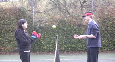
He did, however, like the way in which we stepped away from each other (Emily and I) in the tennis courts whilst throwing a tennis ball to and fro, a metaphorical way of showing the growing distancing between the two characters in terms of their relationship.

Finished on Friday 12th March (2010) and including the proposed 'Super 8mm Effect' (I think the flashback shots should be slowed down more to give more of an older feel to these particular shots), this is the Second Edit (below), though I must warn you that it's not the final version!

Thursday, 11 March 2010

DigiPak: CD Cover Designs using PhotoShop

Today we used the iMacs again, but this time we were given an introduction to the iMac computer programme PhotoShop. We will use this to eventually design the final copy of our decided Group CD Cover. We were given the task of, well, fiddling around with the programme to see what each button does and how creative we can be with PhotoShop. I designed the CD Cover below.

It contains elements which I thought were both useful and descriptive of our Video.

Wednesday, 3 March 2010

Emily and Josh's Ideas for The Promotional Package (CD Album Cover)

THE IMAGE BELOW IS THE IMAGE WE HOPE TO USE ON

OUR FINAL CD/DVD DIGIPAK DESIGNS!!


EMILY SWAGER'S INITIAL DESIGN FOR CD/DVD DIGIPAK COVER:

JOSHUA PAYNE'S INITIAL DESIGNS FOR CD/DVD DIGIPAK COVER: