
When we first started to research typical music promotional videos in our class, we focused on the contrasts between Rap and Hip Hop videos to Rock videos. I noticed that the majority of them were very stylised according to their music genre. As I have researched, the band Massive Attack tried to be different but intelligently different from other bands. Strange narratives and unusual cinematography contrast with videos of bands like AC/DC who make videos based around performance rather than a narrative, with a live crowd.
After analysing three Noah and the Whale music promotional videos, I can confidently suggest that their videos have 'quirky' effects and storylines, with a little teenage humour added in "Shape Of My Heart", a narrative which tries to follow the lyrics in "2 Bodies 1 Heart" and "5 Years Time", and some scenes from their film The First Days of Spring in the video "Blue Skies". We tried to follow the conventions of music video filmmaking that Noah and the Whale had used, adding a light-hearted but also strange and dark narrative to our version of "5 Years Time".
As Josh has clevely stated on his Blog, we aimed to create a "finished music video which combines style and quiet sophistication – there is a storyline that is about heartbreak". We used a Super 8mm Effect to give the flashbacks more of a home movie feel with occasionally chaotic camera work, therefore sticking to Noah and the Whale's 'quirky' effects.

I think our video for 5 Years Time follows conventions and stylistics of contemporary music promtional videos and especially as set out in Noah and the Whale's videos, such as a happy mood or the sometimes quirky narrative. The narrative of our video consists of a relationship between a boy and a girl, but the relationship was in the past and therefore the main purpose of the video is to show the memories he has of the happy times together.
There is no real gain from just producing any old video which either copies the conventions or manipulates the point of the task, by producing a similar narrative to that seen in the original video by the group themselves. Therefore, to create a realistic state of originality in ideas, camerawork and narrative, we adopted some of the techniques we had used last year in our Film Noirs, such as the Film-Noir specific "Dutch Tilt" for the handheld, home movie-styled, flashback shots. The combination of the adoption of Film-Noir specific conventions and those conventions normally used in both traditional and contemporary music promotional videos therefore created for us the ideological set up and verisimilitude for a music video, in terms of Mise-En-Scene, Cinematography, and Editing and transitions.

2. How effective is the combination of your main product and ancillary texts?
(ABOVE IS EMILY'S INITIAL IDEA FOR A CD/DVD DIGIPAK COVER)
We were initially asked to analyse a Promotional Package to get us thinking about Posters and CD Covers/DigiPak ideas and designs. I had analysed Mika's The Boy Who Knew Too Much, looking at how a theme was kept closely linked between the Print Ad (poster) and CD Cover. From here, as a group we each selected three different Noah and the Whale CD covers and Posters to analyse. The three Covers I had analysed were the E-Single of 5 Years Time, CD Album Peaceful, the World Lays Me Down, and CD Album The First Days Of Spring. I noted how they were stylised according to the videos for the songs on each of the CDs. Based on this initial and development of group ideas, we tried to follow the conventions of Posters and DigiPaks/CD Covers that Noah and the Whale had used, adding our own personal touch to our version of a DigiPak and Print Ad for "5 Years Time".
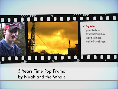
ABOVE IS A POWERPOINT PRESENTATION WHICH I PREPARED FOR CLASS BUT NEVER REALLY SHOWED TO OUR CLASS. IT IS A PRESENTATION TO VIDEO COVERSION, USING VIDEO CONVERSION SOFTWARE FROM THE INTERNET.
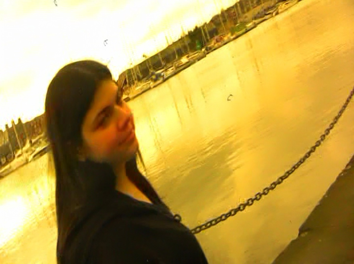
The Promotional Package that I created with my group consisted of a music promotional video, a CD DigiPak Cover, and a Promotional Poster (Print Ad). The purpose of the package was to plan, film and edit a video for a chosen song (“5 Years Time” by Noah and the Whale), and then design two ancillary texts based around the video, the song and the artist. Whilst Josh edited the video in Post-Production, I set about researching the Super 8mm old film effect we had discussed using on the internet, and experimenting around with a few shots from the main video I created the basis effect for the flashback moments in our video narrative. Whilst Josh and I were editing, Emily researched Noah and the Whale’s previous CD and Poster campaigns, and then started creating some basic designs for us as a group to discuss. After discussion, we tried to keep a theme running through all three products in the Promotional Package. I created screenshot photographs of the video so that Emily could insert these images onto the designs for the CD DigiPak and the Poster. We wanted to use a shot of me and Emily in the tennis courts on the front cover of the CD DigiPak and in a similar sort of way on the Poster.
.jpg)

3. What have you learned from your audience feedback?
POP PROMO:
Having researched Noah and the Whale and their current fan base, our target audience remained as fans of British Indie and Folk music genres, especially ‘Nu-Folk’, which would be mostly teenagers and young people; therefore we knew how to aim our video at this audience with fashionable and recognizable narratives.


CD COVER & DIGIPAK:
In terms of the other two ancillary texts, however, our fellow classmates did not like the designs at all. There seemed to be no good areas, just a lot of weak areas and concerns. On the CD cover, the four images used were too contrasting and too random; the ducks under the CD placement holder were too blurred, the colours and styles of typeface (font) used looked too amateur, and the yellow image on the inside was not liked as it was also too amateurish. The front cover seemed to be ‘cheap’ (stretched), and should have been brighter to add emphasis to this part of the whole four-sided CD cover. The images were too contrasting, and four Polaroid-style photographs or images would have been better. Basically, fonts & typography were cheap and colours were used too much.
Therefore, in conclusion, I can honestly say that there seemed to be no real suitability and combination of all three promotional package elements for the target audience, according to our class, who would have been the most suitable target audience. The video worked well, but the themes used in the video were not effectively continued on the CD DigiPak covers or the Poster Print Advertisement.
4. How did you use media technologies in the research and planning, construction, and evaluation stages? (Significance of using these technologies)

I used a home editing software package on my PC at home to create a Storyboards Animatic. The software I used was Microsoft Windows Movie Maker, which comes as standard on the Microsoft Windows XP Home Edition Operating System. I had used this for last year’s Animatic when doing the Film Noir, so I knew how to use the software and knew how to use it effectively.

During the filming and editing of last year’s project (Film Noir), I had set up a YouTube Channel to post videos and then link to these via my Blog. I used my YouTube Channel once again this year during the capturing of footage to record and post Outtakes, Test Footage, the Storyboards Animatic and initial edits.
This year was similar to last year in terms of technology used in the production of our music promotional video; therefore no extra time-wasting training was needed. We used a Canon Mini DV-1 Tape Camcorder, with Mini DV Tapes and DV-1 Camcorder Batteries, and a Tripod system for use with the camcorder. We did not require microphones or sound boosters as the sound which we would need would be non-diegetic (music) and therefore no sound was required from the characters in terms of exchanging lines of dialogue. Thus, we proceeded ahead with the filming with the simple built-in microphone of the Camcorder. We decided to use the Camcorder handheld for the flashback shots to deliberately have shaky handheld movements to reflect the happiness felt through the memories and flashbacks, therefore separating the camcorder from the tripod for handheld usage.
(ABOVE: MY EVALUATIVE DVD VIDEO VOICEOVER COMMENTARY)
After filming and capturing our footage we concentrated our main efforts on learning how to use the new Final Cut Pro video editing software in the Apple iMac Editing Suite. We started by editing the project as a group rather than handing the job straight over to our Chief Editor Josh, so that we could all understand how to use the program effectively for our own individual job roles. When we were happy, Josh started to edit the video, relating to my Storyboards and Animatic on my Blog, while I started researching and experimenting with different effects such as the Super 8mm old film effect, using both the Internet as a search resource and Final Cut Pro for the experimenting with effects. Emily at this point tried her luck at designing and creating a CD DigiPak cover and Poster using Adobe Photoshop on the iMacs.
(ABOVE: JOSH'S EVALUATIVE DVD VIDEO VOICEOVER COMMENTARY)
Whilst it was principally Emily who created and designed the CD covers and Print Advertisements, I selected all the shots from the captured footage and organized them under headings – test footage and the outtakes. After compiling several shots, I successfully completed two complimentary videos for the Pop Promo if put onto a DVD disc – The Test Footage video, and The Outtakes (which lasted for around 15 minutes and included not only the Gag Reel but also Deleted Scenes and shots not used in the Pop Promo.
I wasn’t asked to actually physically create a DVD disc for the DigiPak package, but think about the Special Features to go on that disc. However, in my spare time, I went one step further - I actually created two or three fully-operational DVD discs for DVD Players, with videos and extras as well on the Special Features menu, using DVD Studio Pro, to see how I could utilize my technological skills. I made improvements such as Menu functionality and numbers of options to select, and fixed a problem where, when one video had finished, the DVD Player had assumed the DVD had finished. I fixed this by programming each video or Special Feature to jump back to the menu at the end of playback. I also included a few image slideshows – storyboard images, production images, and post-production images.
On top of these computer programs, I used a free download of a "powerpoint to video converter" utility program to upload one or two PowerPoint Presentations onto my Blog. One of the conversions is above, under 'Question Two'.
As part of the finalising of the Project and Evaluative stages, we each constructed a video commentary to be placed on top of the video as an audio file. The order of the videos is as follows: Chris Kenworthy (Director & Cameraman) - ABOVE, Josh Payne (Chief Editor) - ABOVE, Emily Swager (Art Director) - BELOW.
